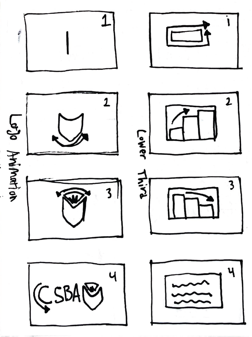
For the CSBA interviews, I wanted to take full advantage of what the association's brand guidelines had to offer. The organization has a wide color scheme, but only the primaries were largely used in marketing collateral. This was the basis for the intros and outros that I developed for each interview clip. I also felt that while the logo was visually appealing, it didn't have a lot of creative real estate for video productions. This is why for the conceptual refresh, I build a dynamic logo that forms with each letter and glyph, partly inspired by the logo animation for The Futur. The same approach can be said for the lower thirds developed to identify each interviewee. In the past, I had gotten use to basic sliding cards with names and titles, but I wanted to add something more energetic to give the impression of CSBA as a vibrant organization with great offerings for those who seek them out.
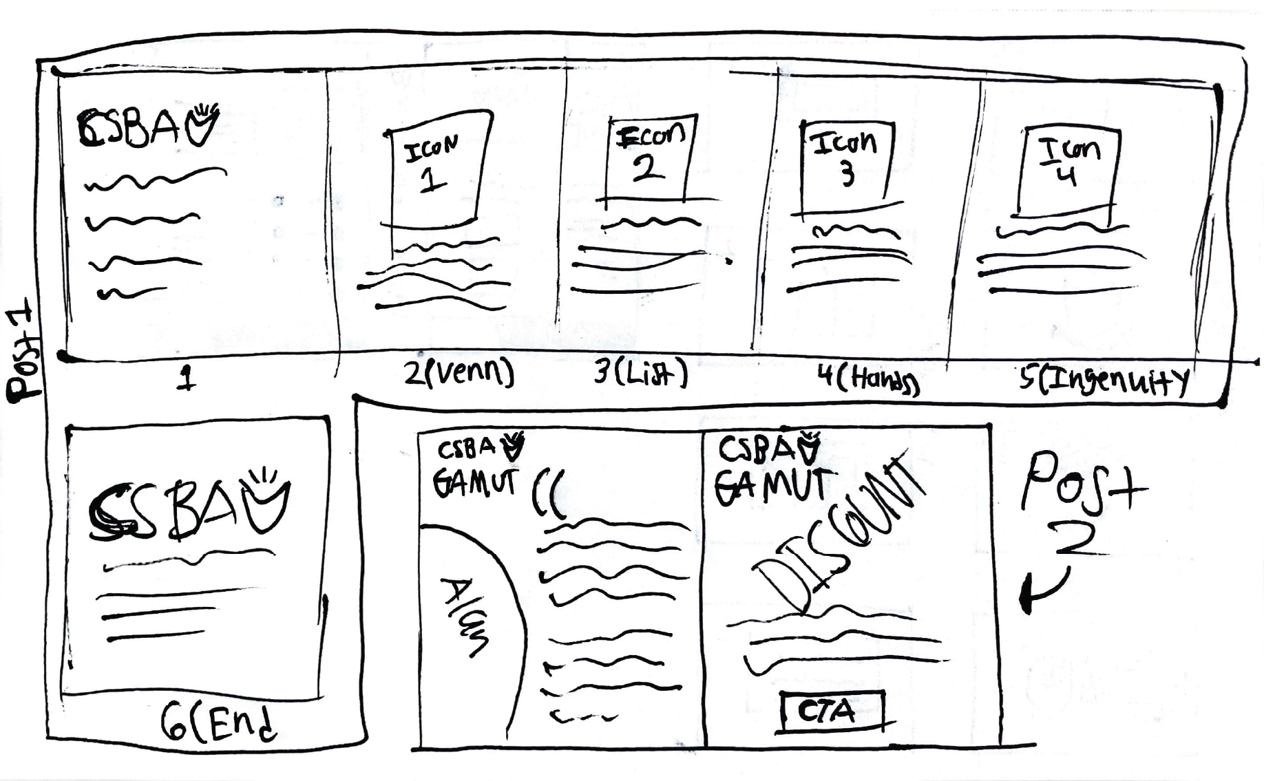
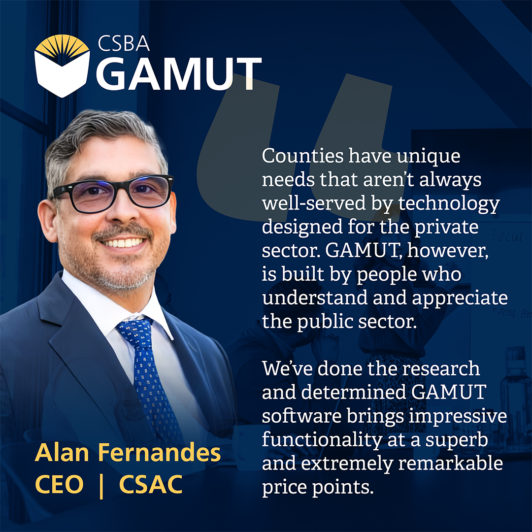
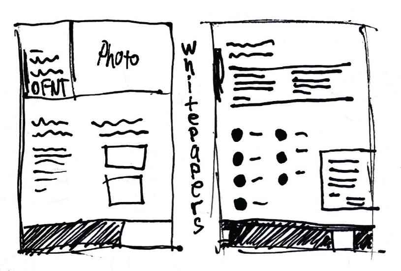
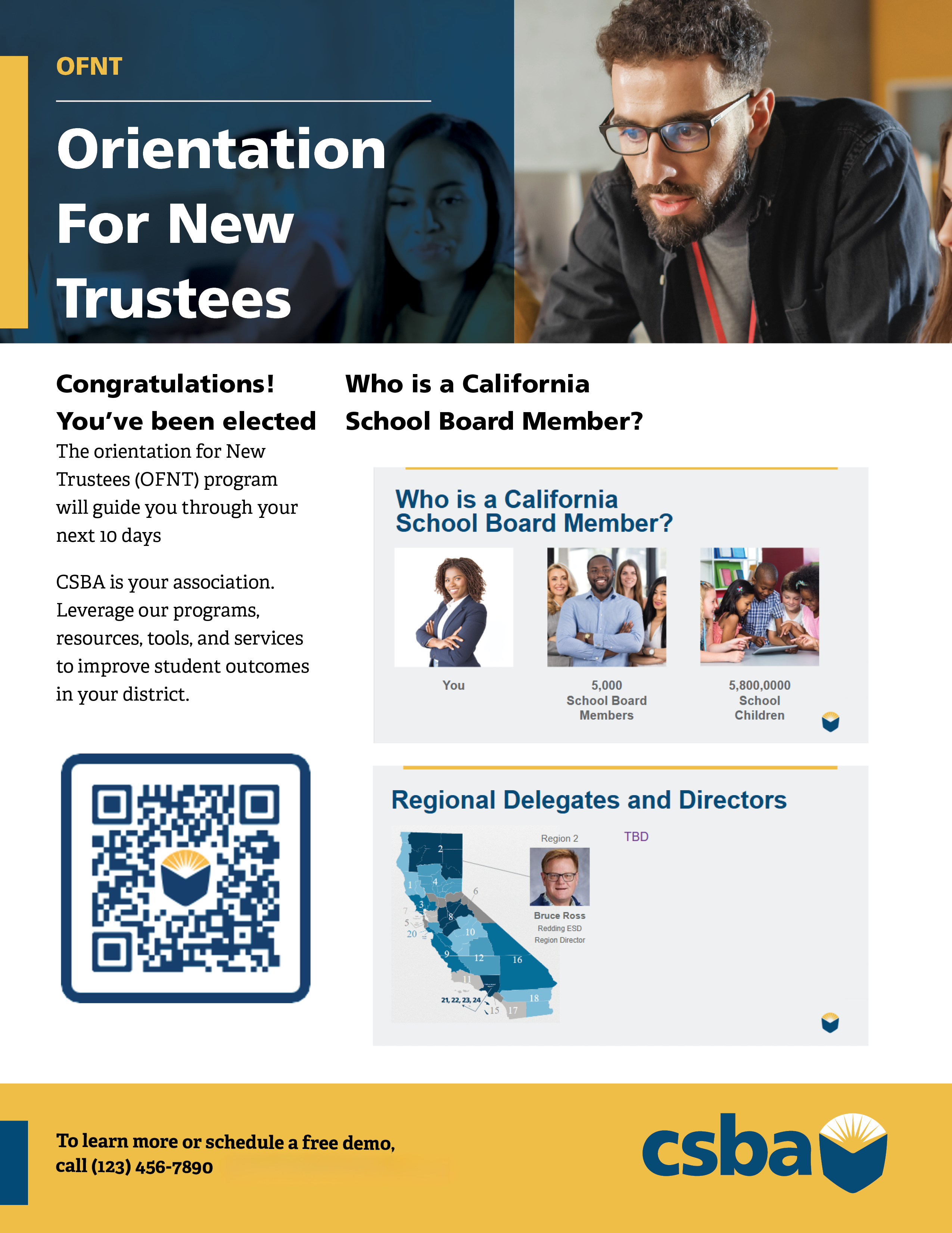
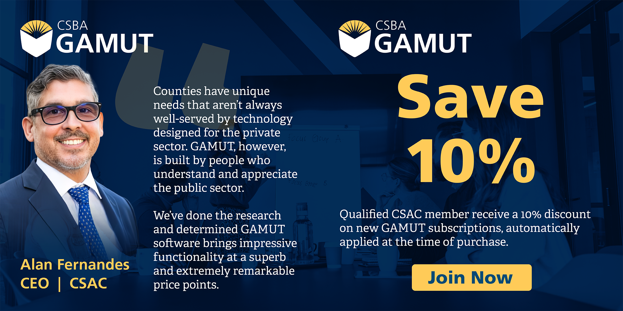
The visual style of the videos helped inform how I wanted to approach promoting their GAMUT benefits on social media and print/digital whitepapers. However, these materials were intended for an audience in a different portion of our marketing channel, and so the visual approach took a more firm layout that spelled out training opportunities and benefits to viewers from all backgrounds.

